Growth Flow
Making the next decision easier.
THE CONTEXT
A question
worth exploring.
THE BRIEF
Growth teams can collect plenty of data and still struggle to decide what to do next. This concept brings acquisition, activation and experimentation into one workspace for a small ecommerce team.
THE DESIGN CHALLENGE
Create a useful path from a high-level number to the behaviour behind it. The interface should make comparison easy, show what needs attention and keep the next action close to the evidence.
An original portfolio concept. The screens use illustrative content and sample data.
THE APPROACH
The decisions
behind the details.
- 01
Start with the decision
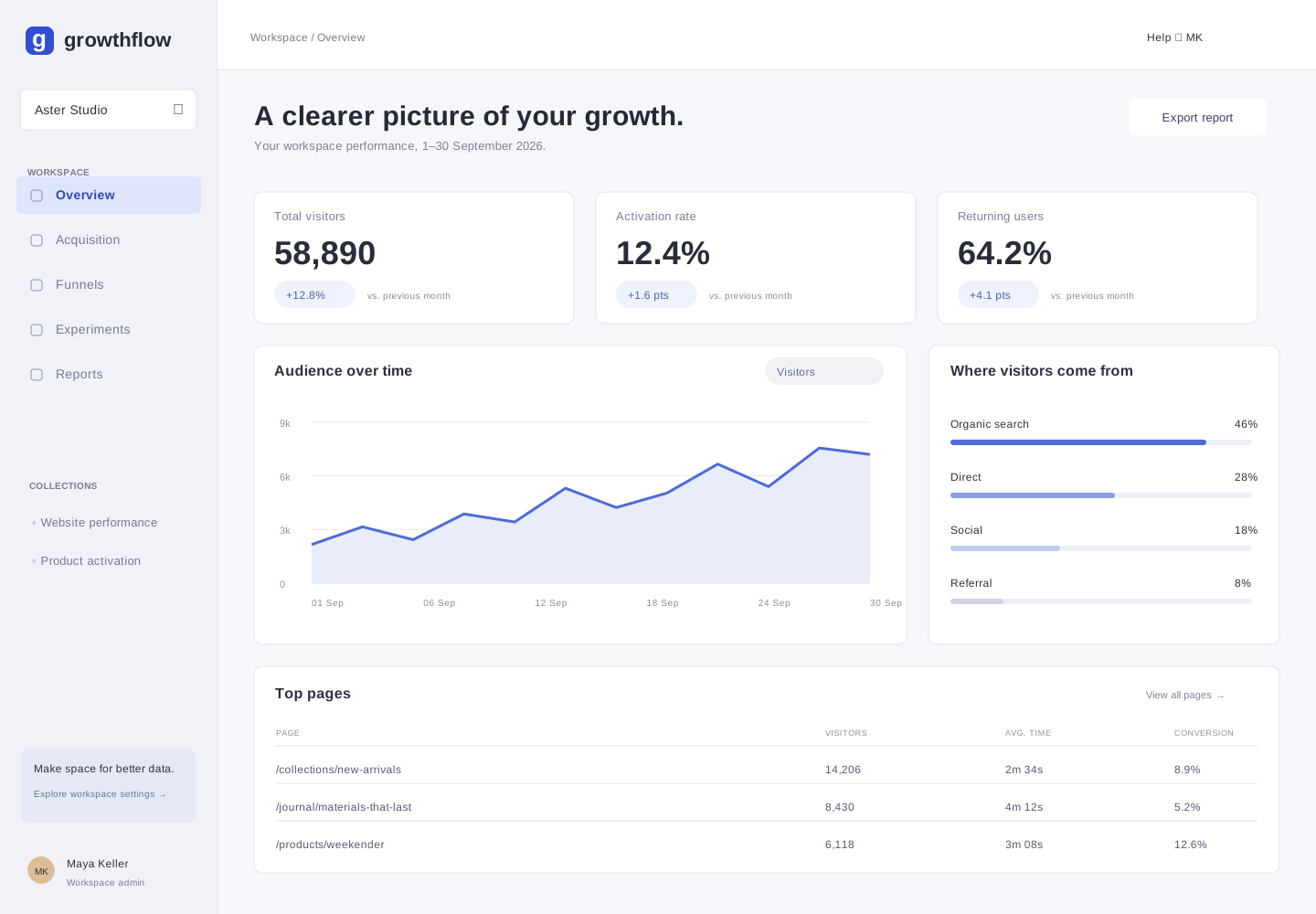
The overview gives visitors, activation and return behaviour equal weight. Each metric includes a comparison period so a large number is never left without context.
- 02
Show the drop-off, not just the total
The funnel uses a shared scale and explicit counts. That makes the gap between starting and completing checkout easy to spot without comparing separate charts.
- 03
Connect insight to a next step
Experiments sit beside the reporting tools, with a hypothesis, status and primary metric. Onboarding asks for a goal before asking the user to configure a dashboard.
A closer look.
Five connected views. Open any image to see the details ↗
An overview with a clear hierarchy
A small set of comparable metrics, an audience trend, acquisition sources and a useful page-level breakdown.
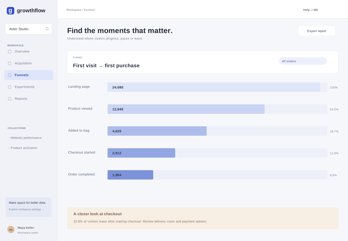
Where the journey breaks down
A five-step purchase funnel makes drop-off visible and identifies the next point to investigate.
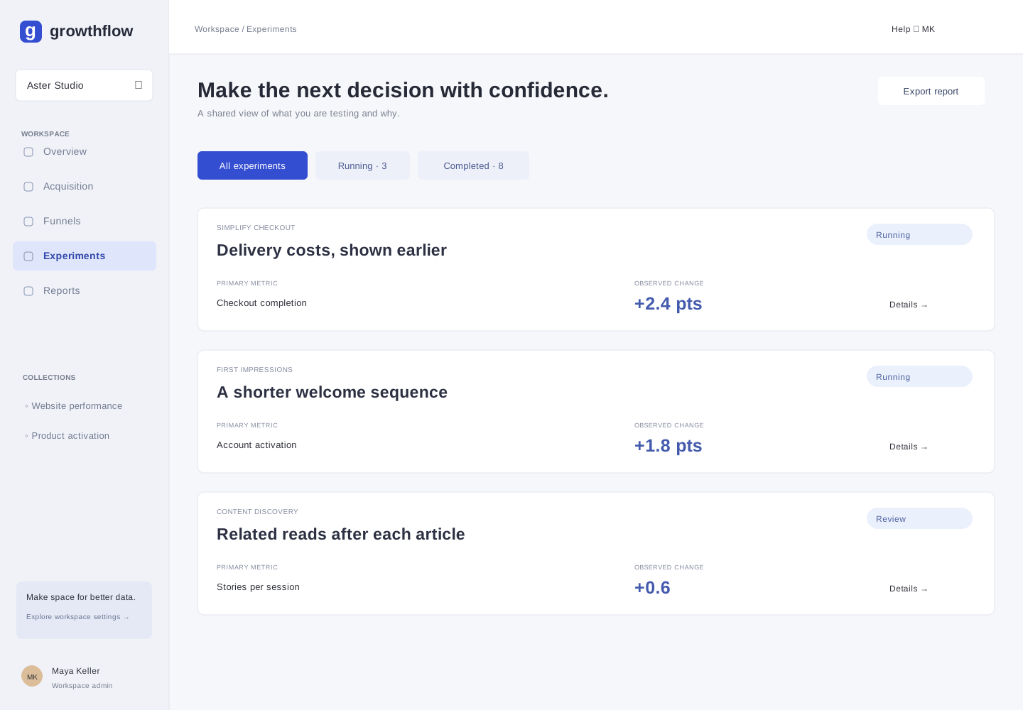
A shared view of experiments
An experiment list connects each change to the behaviour it is intended to improve.
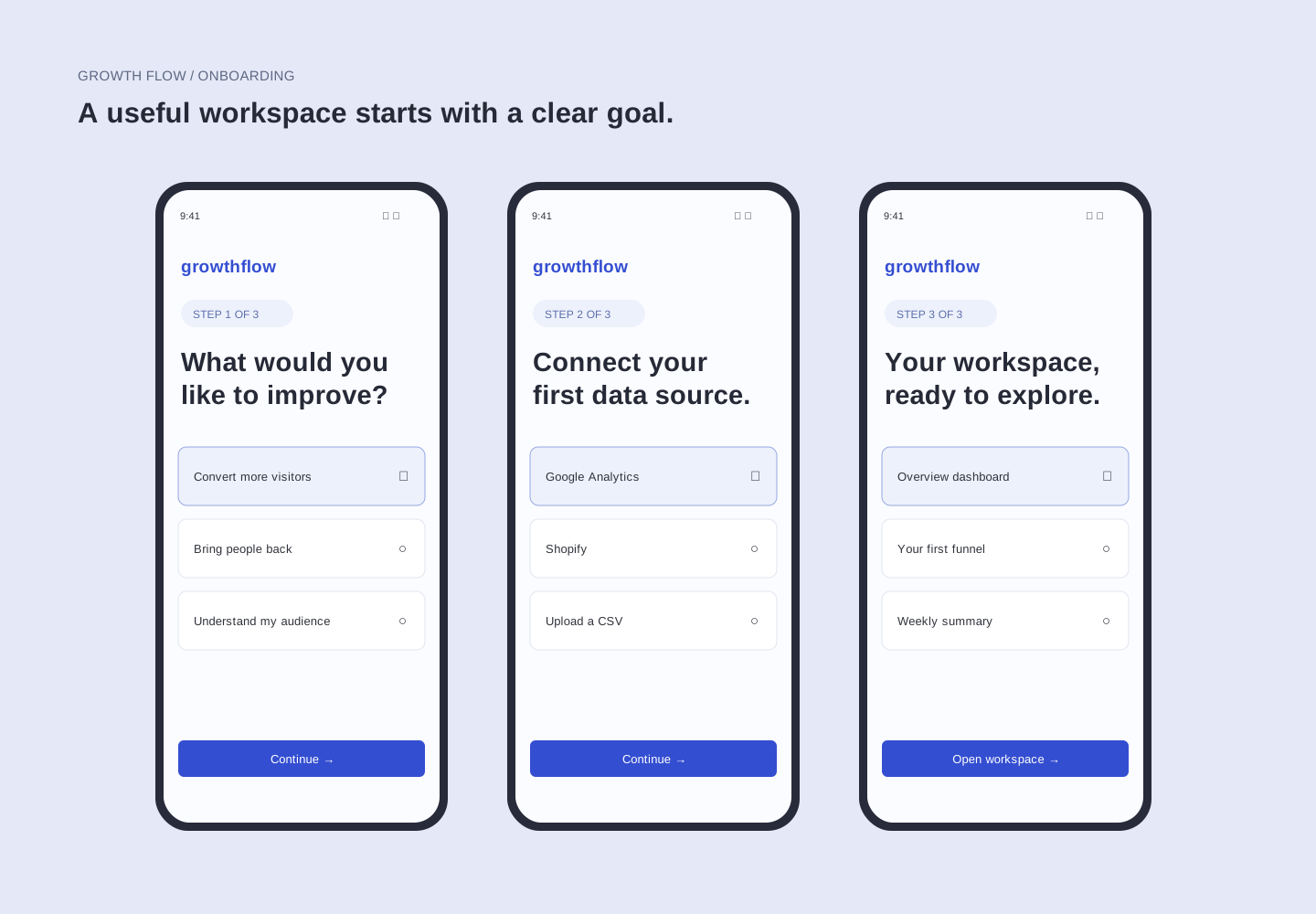
Onboarding built around intent
Three connected steps introduce a goal, a data source and a ready-to-use workspace.
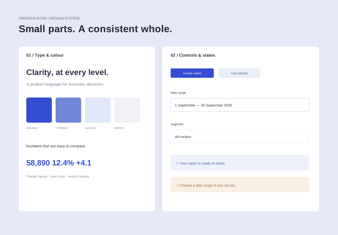
A system for the everyday states
A compact foundation for type, colour, input fields, confirmations and guidance.
REFLECTION
Where this
goes next.
The finished concept connects an overview, funnel analysis, experiments and onboarding through one interface language. The next step would be to test whether a new user can identify a checkout problem and choose a useful experiment without guidance.
- Can a user distinguish volume from conversion at a glance?
- Is the drop-off explanation clear without relying on colour?
- Does the onboarding goal produce a useful first dashboard?